In order to get my ideas in a visual form, I have done a small test shoot. I took 3 of my ideas that were easily accessible to me ; an empty pill packet, empty shower bottles and empty toilet roll.
I experimented mostly with flash vs no flash, because I want the images to be somewhat consistent.
I was thinking about using studio lights, however if i'm going to be taking photos on the go, this won't be realistically possible as I can't take huge lights everywhere I go, so I either use available lighting or my in camera flash as I don't own an adaptable flash.


Although the editing improves the image without the flash, I still prefer the one with the flash.
For both, I increased the clarity, contrast and straightened out the image.
While of course these aren't the most interesting images, I feel that the bluntness and clarity of it all is very obvious and leaves little room for confusion, especially when paired with all the other images of inconveniences.

This isn't my most favourite image, as it' just not that interesting to me. The contrast is strong, and I like the texture however i'm doubting that the way I shot this is the best way to go about it for this particular image. I feel perhaps a more cinematic approach would make the image more interesting.
This image also plays on the idea of how we get annoyed at the minor things, particularly running out of things that we thought we had more of.
The way you can see the name of the pill makes this image more personal to me because it's my pills that I had to take for a heart burn issue, and it insinuates that because of my own human error I will have to pay the consequences.
This image is perhaps my favourite from this small shoot, it's much more vibrant and stands out a lot more than the others, probably because they were rather monotone whereas this image has more colour.
The contrast was also bumped to allow for a more 'popping' image. The brand being visible allows for the audience to see more about me; if the audience is from the UK then the will recognise the wilko brand and know it's cheap, and so it says something about my class and income. However, that's not the point of this image. The bottles are clearly empty, and that's the point; the annoyance in this image is the running out of shower gel which can be incredibly annoying to anybody. The bottles do clearly say body wash however I feel that people can also relate this back to shampoo, conditioner and any other bath product that they've experienced running out of.
In conclusion;
I will be looking at shooting these images in a more cinematic way, I might just have to recreate everything I see rather than shooting as I see the moment.
I'll continue shooting this way but also experiment with shooting in the more cinematic way. I don't hate the way i've shot these and perhaps they'll work better all together than as single images but this isn't the way I imagined them.
I experimented mostly with flash vs no flash, because I want the images to be somewhat consistent.
I was thinking about using studio lights, however if i'm going to be taking photos on the go, this won't be realistically possible as I can't take huge lights everywhere I go, so I either use available lighting or my in camera flash as I don't own an adaptable flash.

The images above are unedited, untouched and straight from the camera.
The image without the flash feel rather flat, however this could be improved through editing. It does feel a lot more real than the image with flash because that's how we see the images in real life, through our own eyes as the scenario happens.
The image with the flash has a lot more contrast, and the shadows give it a lot more depth than the image without the flash.
Because of the flash being so bright I had to stop down a lot, meaning everything will be in focus, rather than the first image where I had to use f4 because of the low light in the room. You can see that the holder on the wall isn't in focus like it is in the bottom image. This gives the image with flash a much more harsh look because all the edges are well in focus and not softened.
This is further amplified by the shadows formed by the flash which are again much more strong than the shadows without the flash.
Although you can see the flash bounce off the wall, I don't think that bothers me too much because I'm not trying to hide the fact that i'm using a flash. I don't think it's too distracting, but if I change my mind I am capable of editing it out.
The flash version feels a lot more unnatural, and many feel that natural = beautiful, meaning unnatural is ugly. However I feel that this could be used to my advantage, as this project is going to be a lot about human pettiness and the things that annoy us, so this could intertwine with my theme very well; it's stark, blunt and ugly, much like our feelings towards the scenarios when they happen and we have that 'ah shit' moment.
I think after writing out my thoughts on flash vs no flash it's clear as to which I prefer, and I think i'll continue experimenting with flash from now on. I will still take images without flash in case I change my mind, however.
I then edited both of the images in Photoshop;


Although the editing improves the image without the flash, I still prefer the one with the flash.
For both, I increased the clarity, contrast and straightened out the image.
While of course these aren't the most interesting images, I feel that the bluntness and clarity of it all is very obvious and leaves little room for confusion, especially when paired with all the other images of inconveniences.

This isn't my most favourite image, as it' just not that interesting to me. The contrast is strong, and I like the texture however i'm doubting that the way I shot this is the best way to go about it for this particular image. I feel perhaps a more cinematic approach would make the image more interesting.
This image also plays on the idea of how we get annoyed at the minor things, particularly running out of things that we thought we had more of.
The way you can see the name of the pill makes this image more personal to me because it's my pills that I had to take for a heart burn issue, and it insinuates that because of my own human error I will have to pay the consequences.

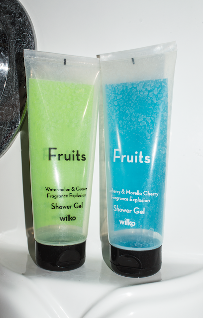
This image is perhaps my favourite from this small shoot, it's much more vibrant and stands out a lot more than the others, probably because they were rather monotone whereas this image has more colour.
The contrast was also bumped to allow for a more 'popping' image. The brand being visible allows for the audience to see more about me; if the audience is from the UK then the will recognise the wilko brand and know it's cheap, and so it says something about my class and income. However, that's not the point of this image. The bottles are clearly empty, and that's the point; the annoyance in this image is the running out of shower gel which can be incredibly annoying to anybody. The bottles do clearly say body wash however I feel that people can also relate this back to shampoo, conditioner and any other bath product that they've experienced running out of.
In conclusion;
I will be looking at shooting these images in a more cinematic way, I might just have to recreate everything I see rather than shooting as I see the moment.
I'll continue shooting this way but also experiment with shooting in the more cinematic way. I don't hate the way i've shot these and perhaps they'll work better all together than as single images but this isn't the way I imagined them.
Comments
Post a Comment